Foundations
Colours
Primary colours
The primary colours are #2D7F3B, #389AD9, and #4A4A4A
- Use #2D7F3B (green) for linking to other pages (or external links).
- Use #389AD9 (blue) for interactions within the same page.
- Use #4A4A4A (gray) for the body text colour.
- Use either #2D7F3B (green) or #389AD9 (blue) to highlight a component or grab attention, as long as it cannot be confused with a clickable element.
Secondary colours
The secondary colours are #679A24, #F7941D, #274E78 and the grays #000000, #7F7E7F, #D0D0D0, #EFEFEF
- Use secondary colours alongside the primary colours when a cyclical series of colours are used. See the tiles on the homepage for an example.
- Use grays for background elements and stroke. The shade should be selected according to accessibility requirements.
- Use #F7941D (orange) sparingly for an extra prominent highlight or for orientation elements such as marking the current location on a progress bar.
Typography
Body text
Example
The quick brown fox jumps over the lazy dog
Notes
- The primary typeface is Roboto.
- The max text width is set to 590px for ease of readability.
Header 1 (H1)
Example
The quick brown fox jump…
Notes
- Use this header for the main page title at the top of the page.
- Never use more than one H1 per page.
Header 2 (H2)
Example
The quick brown fox jumps over the…
Notes
- Use this header to delineate sections within a page and for the sub-header on the homepage.
- Make sure H2 headings are always nested under the H1 heading.
Header 3 (H3)
Example
The quick brown fox jumps over the lazy dog
Notes
- Use this style for sub-sections within a page and for content sections in the right sidebar.
- Make sure H3 headings are always nested under an H2 heading.
Header 4 (H4)
Example
The quick brown fox jumps over the lazy dog
Notes
- Use this header for sub-sub-sections within a page.
- Make sure H4 headings are always nested under an H3 heading.
Link text
Example
The quick brown fox jumps over the lazy dog
Notes
- Style links consistently no matter if they appear within a paragraph, bulleted list, or are placed on their own.
Iconography
Icons are published in many places throughout the website using a custom font created for FLWS. To add an icon to an element, first define the size, colour, and positioning of the icon using CSS and then attach it using a css class.
Service icons
Notes
- There are icons for each of the major sections of the website.
- three audience categories
- three audience categories
- two types of divorce application
- The connection between the service or object and the icon should be an obvious, linear connection (such as a child’s hand to represent children). Reach out to subject matter experts for a review of any icons used to represent sensitive subject matter.
- These icons derive their shape from the angular style of the FLWS logo. They make use of lines and cut-out shapes to form an image.
- These icons are always styled against the #679A24 (secondary green) colour.
Get help icons
Notes
- These icons use the most prominent colours from both the primary and secondary colour palettes. They should stand out from the header content to enhance findability.
Sub-header icons
Notes
- These icons are simplified due to their small size and position in the header. They should not take prominence away from the other header items.
- These icons derive their shape from the angular style of the FLWS logo. They contrast the Get Help icons in that they use a consistent stroke width, rather than filled in shapes.
Page layouts
Page layouts use the Bootstrap grid system. More information about the system can be found in the Bootstrap documentation.
Single-column
Two-column
Three-column
Grids
These grid structures sit within the main content column.
100%
- The 100% grid is used within the Info Page content type.
50% (Halves - grid)
- The 50% grid is used within the Info Page content type as well as other specialized content types.
33.33% (Thirds-flexbox)
- The 33.33% grid is used for tiles on the Landing Page content type and for the Scenarios routing links.
- This grid style isn't meant to be re-usable, but the code can be adapted for other elements.
Responsive
This site is coded to be mobile-first responsive. CSS is declared and then is overwritten at certain breakpoints if a css change is needed. The pixel widths below represent the minimum width at which that named breakpoint is active (e.g. the "small screen" view is active from 480px to 767px).
The breakpoints are as follows:
Extra-small screen (small phone):
$breakpoint-xs: 320px;
Small screen (phone):
$breakpoint-sm: 480px;
Medium screen (small tablet):
$breakpoint-md: 768px;
Large screen (tablet):
$breakpoint-lg: 991px;
-
When the screen is larger than 991px, components begin to break into multiple columns. The left-side navigation and top navigation replace the condensed hamburger menu.
Extra large screen (desktop/laptop/large tablet):
$breakpoint-xl: 1200px;
XXL screen (large desktop screen):
$breakpoint-xxl: 1600px;
Components
Tiles
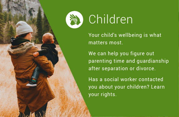
Homepage tile - primary
Example
CSS attributes (heading)
font-family: "Roboto",sans-serif;
font-size: 38px;
line-height: 40px;
color: #ffffff;
font-weight: 300;
letter-spacing: 0.8px;
CSS attributes (body)
(same as body copy except)
font-size: 16px;
color: #ffffff;
CSS attributes (hover)
transform: scale(1.02);
background: rgba(0, 0, 0, 0.2);
(The hover state changes are consistent across all tiles)
Image specs
1160px x 375px
JPEG at 60% quality
Notes
- The first tile on the homepage will automatically display at full-width. The entire box is clickable and points to a single page on the website.
- Use images that are people oriented, positive and uplifting. Don't attempt to be overly emotive.
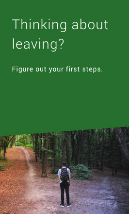
Homepage tile - secondary
Example
CSS attributes are as above
Image specs
575px x 375px
JPEG at 60% quality
Notes
- Use the secondary tiles in pairs for the content categories on the homepage. There must be an odd number of tiles (including the primary tile) for the layout to work as designed.
- The entire box is clickable and points to a single page on the website.
- Colours use a mix of primary and secondary colours, in the following sequence: #2D7F3B (dark green), #679A24 (light green), #389AD9 (light blue), #274E78 (dark blue)
- Use images that are people oriented, positive and uplifting. Don't attempt to be overly emotive.
Homepage tile - tertiary
Example
CSS attributes (heading)
font-family: "Roboto",sans-serif;
font-size: 28px;
line-height: 36px;
color: #4A4A4A;
font-weight: 300;
letter-spacing: 1.2px;
CSS attributes (body)
font-size: 1.6rem;
color: #4A4A4A;
CSS Attributes (hover)
transform: scale(1.02);
background: #d6d6d6;
Notes
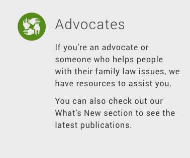
- Use the tertiary tiles with a three-column layout for audience-specific links on the homepage.
- The entire box is clickable and points to a single page on the website.
Landing page tile
Example
CSS attributes (heading)
font-family: "Roboto",sans-serif;
font-size: 28px;
line-height: 40px;
color: #ffffff;
font-weight: 300;
letter-spacing: 1.2px;
CSS attributes (body)
(same as body copy except)
color: #ffffff;
CSS attributes (hover)
background: rgba(0,0,0,0.2);
Image specs
575px x 375px
JPEG at 60% quality
Notes
- The entire box is clickable and points to a single page on the website.
- Colours use a mix of primary and secondary colours, in the following sequence: #2D7F3B (dark green), #679A24 (light green), #389AD9 (light blue), #274E78 (dark blue)
- Use images that are people oriented, positive and uplifting. Don't attempt to be overly emotive.
Routing boxes
Example
CSS attributes (text)
font-family: "Roboto",sans-serif;
font-size: 16px;
line-height: 24px;
color: #263138;
font-weight: 400;
letter-spacing: 0.8px;
CSS attributes (container)
background: #EFEFEF;
CSS attributes (hover)
color: #2D7F3B
Notes
- Use up to four routing boxes on a page to link to other content sections outside of the current category (e.g. to link to BC Legal System from the Separation & Divorce landing page).
- The entire box is clickable and points to a single page on the website.
Navigation
Top nav
Example
CSS attributes
font-family: "Roboto",sans-serif;
font-size: 15px;
color: #4A4A4A;
font-weight: 400;
letter-spacing: 0.8px;
CSS attributes (hover)
color: #2D7F3B;
text-decoration: underline;
CSS attributes (active)
color: #2D7F3B
Notes
- The top navigation should be right-aligned within the header.
Side nav
Example
CSS attributes
font-family: Helvetica, sans-serif;
font-size: 14px;
color: #7F7E7F;
font-weight: 400;
letter-spacing: normal;
CSS attributes (hover)
color: #2D7F3B;
text-decoration: underline;
CSS attributes (active)
color: #111111
font-weight: 500;
Notes
- The top link indicated the content section and should always be underlined and in the colour #2D7F3B (dark green).
- Any pages along the navigation path to the current page also use the active state.
Button
Example
Notes
- Use this button style to call out a primary call-to-action on a page. The call-to-action could route to a new page (e.g. a step-by-step guide) or it could download a form.
- Keep button text very short (1 to 3 words).
Tabs
Lorem ipsum dolor sit amet, consectetur adipiscing elit.
Morbi ultrices libero quis fringilla congue. Fusce porttitor augue vitae nisl condimentum feugiat. Vivamus porttitor cursus mauris, ac varius purus porta quis Curabitur malesuada blandit ex accumsan convallis. Aliquam vestibulum semper interdum.
Morbi ultrices libero quis fringilla congue. Fusce porttitor augue vitae nisl condimentum feugiat. Vivamus porttitor cursus mauris, ac varius purus porta quis Curabitur malesuada blandit ex accumsan convallis. Aliquam vestibulum semper interdum.
Donec eleifend quam ut nulla efficitur, sed aliquet ante aliquam.
Donec eleifend quam ut nulla efficitur, sed aliquet ante aliquam.
Aliquam condimentum urna ut massa cursus, nec hendrerit odio venenatis. Donec vitae ipsum tortor.
Aliquam condimentum urna ut massa cursus, nec hendrerit odio venenatis. Donec vitae ipsum tortor.
Praesent sagittis arcu eu dolor pharetra fringilla. Donec dictum maximus tempor. Integer fermentum, urna ac bibendum viverra, urna nulla malesuada tellus, ac vulputate lacus dui id mi. Integer in nunc ac purus ultricies pretium. Integer sit amet nisi eros. Donec in scelerisque nunc.
Praesent sagittis arcu eu dolor pharetra fringilla. Donec dictum maximus tempor. Integer fermentum, urna ac bibendum viverra, urna nulla malesuada tellus, ac vulputate lacus dui id mi. Integer in nunc ac purus ultricies pretium. Integer sit amet nisi eros. Donec in scelerisque nunc.
Integer vel risus bibendum, viverra nulla in, dignissim nulla. Fusce elementum, libero ut hendrerit feugiat, odio dui lobortis lorem, ut fermentum dui nibh ullamcorper nibh. Nam et pretium lorem. Vestibulum felis diam, rutrum ut pulvinar viverra, viverra vitae massa. Aenean maximus consequat nunc sed porta.a
Integer vel risus bibendum, viverra nulla in, dignissim nulla. Fusce elementum, libero ut hendrerit feugiat, odio dui lobortis lorem, ut fermentum dui nibh ullamcorper nibh. Nam et pretium lorem. Vestibulum felis diam, rutrum ut pulvinar viverra, viverra vitae massa. Aenean maximus consequat nunc sed porta.
Example
Live example above.
CSS attributes
background: #389AD9;
color: #ffffff;
font-size: 14px;
font-weight: 700;
border-color: #389AD9;
border-width: 1px;
max-width: 170px;
height: 70px;
Notes
- Use tabs at the top of a page, not in the middle.
- Keep tab text very short, with a max of 40 characters.
- If the screen size gets small enough that the tabs won't fit, cut them off and display an arrow to allow the user to scroll to the hidden tabs. Do not show this arrow on mobile.
Expandables
Expandable sections
Example
Live example above.
CSS attributes
color: #389AD9;
font-size: 14px;
font-weight: 700;
border-bottom: solid 1px #D8D8D8;
margin: 24px 0;
max-width: 590px; (label)
CSS attributes (hover)
color: #274E78;
text-decoration: underline;
CSS attributes (icon)
font-size: 20px;
Notes
-
To stack expandable sections on top of one another, use a single border between them.
- The expanded state contains all content within the borders of the expanded area. It can use all rich-text attributes available in the WYSIWYG (such as headings and callout boxes).
Sub-steps for Guides
CSS attributes
(CSS attributes are for the sub-step expandable, the nested expandables are the same as above)
background-color: #389AD9;
color: #ffffff;
font-size: 16px;
font-weight: 700;
border: solid 1px #389AD9;
height: 64px;
width: 100%;
Notes
- Only use this style of expandable section for sub-steps of the Guide process (within the Guides content type). Do not use them to nest expendables in a regular content page.
- The expanded state contains all content within the borders of the expanded area. It can use all rich-text attributes available in the WYSIWYG (such as headings and tip/important boxes).
- The sub-steps can contain regular expandable sections within the sub-step container.
Tables
Example
| Document to serve | Type of service required |
|---|---|
| Application Response (Form F32) | Ordinary service |
| Counterclaim (Form F5) | Ordinary service unless a new person is named as a respondent |
| Child Support Affidavit (Form F37) | Ordinary service |
| Financial Statement (Form F8) | Ordinary service (although you might want to serve it along with your Notice of Family Claim) |
| Notice of Address for Service (Form F10) | Ordinary service |
CSS attributes (table)
border-top: 1px solid #D8D8D8;
border-bottom: 1px solid #D8D8D8;
border-left: none;
border-right: none;
CSS attributes (caption)
font-family: Roboto-Regular;
font-size: 16px;
color: #111111;
line-height: 40px;
letter-spacing: 0.8px;
CSS attributes (header row)
font-family: "Roboto", sans-serif;
font-size: 16px;
line-height: 40px;
color: #4A4A4A;
font-weight: 400;
letter-spacing: 0.8px;
CSS attributes (content)
Uses body text
Notes
- If the screen size is too small to fit the table horizontally, show a scrollbar to allow users to view the rest of the table (on both mobile and desktop).
Callout boxes
Tip box
Example
Notes
- Use the tip box style for information that is supplementary to the main paragraph content.
- Use a dark background with a white icon for callout boxes. Make the icons out of simplified shapes (like the sub-header icons) and use a consistent stroke width. Do not use a filled in shape.
Important box
Example
Notes
- Use the important box style for information that needs more emphasis and visibility than regular content on a page.
- Use a dark background with a white icon for callout boxes. Make the wellness icon out of simplified shapes (like the sub-header icons) and use a consistent stroke width. Do not use a filled in shape.
Emotional bubble
Example
Wellness
Work through this guide at your own pace. There's no need to rush.
CSS attributes (headline)
font-family: Roboto, sans-serif;
font-size: 16px;
line-height: 24px;
color: #4A4A4A;
font-weight: 700;
letter-spacing: 0.8px;
CSS attributes (body)
font-family: Roboto, sans-serif;
font-size: 14px;
line-height: 24px;
color: #4A4A4A;
font-weight: 400;
letter-spacing: 0.8px;
CSS attributes (box)
border: solid 1px #7EB339;
background: #B8E986;
top: 8px;
left: 8px;
Notes
- Keep the box header very short, with a max of 25 characters.
- Make the wellness icon out of simplified shapes (like the sub-header icons) and use a consistent stroke width. Do not use a filled in shape.
Blockquote
Example
"A Search for a Response to Family Claim or Counterclaim filed in this matter."
Notes
- Frame quote text with a blue bar to the left. Use the sharp-corner detail to match the angular style from the FLWS logo.
Definitions
Example
This can be a friend or relative, or you can hire a professional process server.
Notes
-
On hover, use a white box with a shadow and a small notch at the top-centre to display the definition.
Supreme / provincial pill
Example
Notes
-
Do not use these pills as clickable elements, they have been designed as static category indicators.
Guides progress bar
Example
Desktop
Mobile
CSS attributes (unfinished steps)
Number:
font-family: Roboto, sans-serif;
font-size: 20px;
font-weight: 400;
letter-spacing: 0.8px;
line-height: 24px;
color: #767676;
Line:
background: #EFEFEF;
height: 4px;
transform: skew(-30deg);
Text:
font-family: Roboto, sans-serif;
font-size: 13px;
font-weight: 400;
letter-spacing: 0.8px;
line-height: 24px;
color: #767676;
CSS attributes (completed step)
Number:
color: #679A24;
font-weight: 700;
Line:
color: #679A24;
Text:
color: #4A4A4A;
CSS attributes (active step)
Number:
color: #F7941D;
font-weight: 700;
Line:
background: #F7941D;
height: 9px;
Text:
font-weight: 700;
Notes
-
Use this design to show the user's progress on a step-by-step process.
-
On desktop, show the step title and number on the bar. On mobile, condense the bar and show only the step number.
-
If the screen gets small enough that the progress bar won't fit, show a scroll bar underneath to allow side scrolling.


