Use this page style for the majority of content pages on the website. This is for any page that displays information on a specific topic.
Example pages: Divorce
Contents
- Title
- Court indicator
- Content blocks
- WYSIWYG content editor
- Definitions
- Lists
- Tables
- Images
- Videos (specific content)
- Styles
- Boxes (Tip/Important)
- Buttons
- Emotional support (see Emotional support paragraph block)
- Expandables
- Repeatable content
- Tabs
- Subheads
- Two column content
- WYSIWYG content editor
- Quick links
- Videos (sidebar)
- Emotional support
- Menu settings
- Metatags
- Editing tags
- Publish
Title
Compulsory field. This is the name of the page.
You don't need to write the title again at the top of the page when you enter the body content.
If you change the title of a page, Drupal should automatically update the URL and create a redirect. Check the "URL redirects" section of the right sidebar in the "Edit Page" view of that page to be sure.
Court indicator
On each information page, set the indicator for Provincial and/or Supreme court if it applies. This will place a court label/icon at the top of the page under the title.
Content blocks
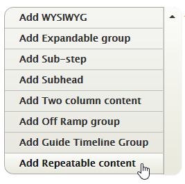
The "CONTENT" block is the main tool for adding information to an information page. It has several options, including:
- WYSIWYG
- Expandable group
- Repeatable content
- Subhead
- Two column content
Use the drop-down arrow to choose between the five options, or just press "Add WYSIWYG" to start adding body copy.
WYSIWYG content editor
This will be the block you use the most. Use this content box for all of the options that you'd usually see in a text editor, including body copy, lists, headings, etc.
Content from a Word document can be pasted to maintain formatting (it will prompt you to strip any extraneous Word HTML). Anything not stripped can be fixed with the "Remove format" button (the "Tx" button).
You can switch between format view (default view) and the HTML view using the "Source" button. View the Source to edit the HTML code directly.
Paragraph format
Normal text
This is the default text style. Use this style for all regular body text content. Add bold, italic, block quote, etc. formatting as needed.
Headings
Select these to delineate content sections within a page.
Don't skip heading levels. Make sure headings are nested under the higher level heading (H2 under H1, H3 under H2, H4 under H3).
Start headings with H2 in info pages. The H1 heading style is already used by the page title and should not be selected in the WYSIWYG editor (unless the page title has been removed for some special reason).
Links
Links pointing to an external website should be indicated with text or an icon. Linked text should be descriptive enough to stand alone and not rely on surrounding copy to indicate where it goes.
Ctrl K is the shortcut to add or edit a link.
To link to a publication, type the name of the publication in the same way you'd type a FLWS page title.
See Linking to odd guides for instructions on linking to
- Write an affidavit
- Write a Supreme Court order
- Write your own separation agreement
See Buttons for how to apply the button style.
Definitions
The first instance of an undefined work on a page should be tagged to bring up the tooltip definition. To add a definition, simply type the word as:
[define:word/term to be defined]
(It doesn't matter if you leave a space between the colon and the word/term or not. It'll format the same way.)
Definitions appear like this:
You can hire a professional process server to serve your documents.
Lists
Lists can be bulleted or numbered. A bulleted list can be nested with a numbered list and vice versa.
- <ul> means unordered list (bullets)
- <ol> means ordered list (numbered list)
- <ol type="a"> starts an alphabetized list (you can also use "i" for roman numerals and "A" or "I" for a capped alpha/rom. list)
- <ol start="3"> will start the list at 3 (you can start it with any number, letter, or roman numeral you need)
- <li> means list item. These tags wrap each individual bullet.
To nest bullets, you'll have to dip into the Source view.
Before the closing </li> tag of the parent list item, insert another opening list tag (either <ol> or <ul>), then your nested list items, then close the list with </ol> or </ul>. For example
<ol>This is a list stem:
    <li>First numbered item:
        <ul>
        <li>nested item.</li>
        </ul>
    </li>
</ol>
Tables
When inserting a table, be sure to set the header row or column. If the screen size gets small enough that the table won't fit horizontally, it will have a scrollbar to allow users to view the rest of the table.
| Header 1 | Header 2 |
|---|---|
| Row 1, Column A | Row 1, Column B |
| Row 2, Column A | Row 2, Column B |
Images
Images are added through the Media Browser (the "E" button at the top of the editor) and can
- take up the full width of the screen, or
- be set to half-width and "floated" to the left or right so that the text flows around them.
The image "bundle" should be selected as "image." An optional caption can be added to the image on the page.
Be sure to fill in the "Alt" text field, used to describe the image content to customers who cannot view the image. This field is required for all images (see the accessibility guidelines for tips on writing alt-text).
Videos
Videos can be embedded from YouTube or Vimeo. Use videos within the WYSIWYG editor for videos that relate only to the specific part of the page content.
Don't set the video to play automatically.
Do set the video to be responsive (size to the person's screen).
Styles
Boxes (Tip/Important)
- Select the tip box style (in the "Styles" drop-down) to for information that is supplementary to the main paragraph content. The boxes can route customers to other areas of the site or bring attention to interesting features and facts related to the page content.
- Select the important box style (in the "Styles" drop-down) to for information and needs more emphasis and visibility than regular content on a page.
Highlighting multiple paragraphs or bullets and applying a style will wrap each line separately like this:
Instead, insert an empty box
Then cut and paste the text from the WYSIWYG into the empty box
Buttons
Use the button style to call out a primary call-to-action on a page. This could be a clear path to a new page (e.g. a step-by-step guide) or to download a form. Button text should be very short (1 to 3 words).
To set a button, you must
- Put the button text on its own line
- Create a link on the text
- Reselect the text and choose the "Primary button" style from the “Styles” drop-down. (The button style won't appear unless you've selected linked text.)
- If the button needs to be right aligned, edit the source to include "pull right" e.g. <a class="btn btn-primary pull-right" href="LINK">BUTTON COPY</a>
Emotional support
See emotional support (block).
Expandables
Use the expandable sections to present users with several, vertically stacked headings of content that can be expanded or collapsed.
Use these when users need to compare information between the section, but may not need all of the information OR when the information under each section is not applicable to all users. This way, users can browse the headings and only expand the areas that are of interest.
If all of the content is important to the same audiences, then don’t hide any of it and have a longer page instead.
Repeatable content
Repeatable content blocks contain information that is used on multiple pages. The advantage to using this content type (over duplicating the same information in a WYSIWYG block) is that changes can be made in one place and will populate to all the locations where a given block is used.
Create/edit repeatable content blocks
With great power comes great responsibility. Editors can create, edit, and delete repeatable blocks, and with that permission comes other access that, used unwisely, can do serious damage to the site.
- Click Structure, Block Layout, and Custom block library
- On the Block Layout page, do not touch the Block layout tab! It's the site admin's page and doesn't have the droids you're looking for.
- To edit, click the name of a block and edit as with any WYSIWYG section.
- To add a block, click +Add custom block
- Choose Basic block
- Add a description and the formatted content
- Save
Add repeatable text to a page
To add repeatable text to a page, choose it from the Add menu in the Edit screen. The dialogue box will let you add more than one custom block here, if there are multiples that can appear one after the other. (For example, Parenting and support and Get legal help may appear together at the end of a guide intro page.)
As with Expandables, Repeatable content blocks are separate from WYSIWYG blocks. You may have to chop up a page a bit to use these blocks.
Tabs
Use tabs when you want to show related information on one page, but users don't need to see information from multiple tabs at the same time. Tabs should be placed at the top of the page and should contain parallel information (e.g. different versions of the same information for different audiences).
If users need to compare information between multiple tabs, then use the expandable sections instead. If the content can be sectioned out into different categories of content, then use multiple pages instead.
Tab labels must have a maximum of 30-40 characters (depending on how the words split).
Subheads
The subhead is a shortcut to drop in an H3 heading. This is the same heading as you would find in the WYSIWYG editor and should follow the same nesting structure (H2 under H1, H3 under H2, H4 under H3).
Two column content
Use the two column content to break the page into two equal width WYSIWYG edited blocks when pieces of information need to be compared alongside each other. This could be selecting between two guides, or showing two lists of parallel information.
Quick links
Use the quick links section sparingly. If left blank, the section will not appear on the page (and the main content will resize to fill the space).
The quick links should not be used as navigation or to highlight content that should be findable on the page. Instead, use this section to link to related outside resources or to pages in another section that might follow from the information on this page (e.g. the ODA, pages that help with court forms, etc.).
Good uses of quick links
- Link to supplementary tools (e.g. Online Divorce Assistant)
- Links to resources for help using the tools in the page (e.g. Tips for using the Supreme Court Word forms)
- Cross links to alternative paths (e.g. linking to Parenting after separation when reading about Separation agreements)
Bad uses of quick links
- Links to sub-pages in the same section
- Links to a big list of forms without context
- Links that are already present in the content of the page
Videos (sidebar)
Videos can be embedded in the sidebar from YouTube or Vimeo. Use this option for videos that relate to all of the page content.
Emotional support/wellness bubbles
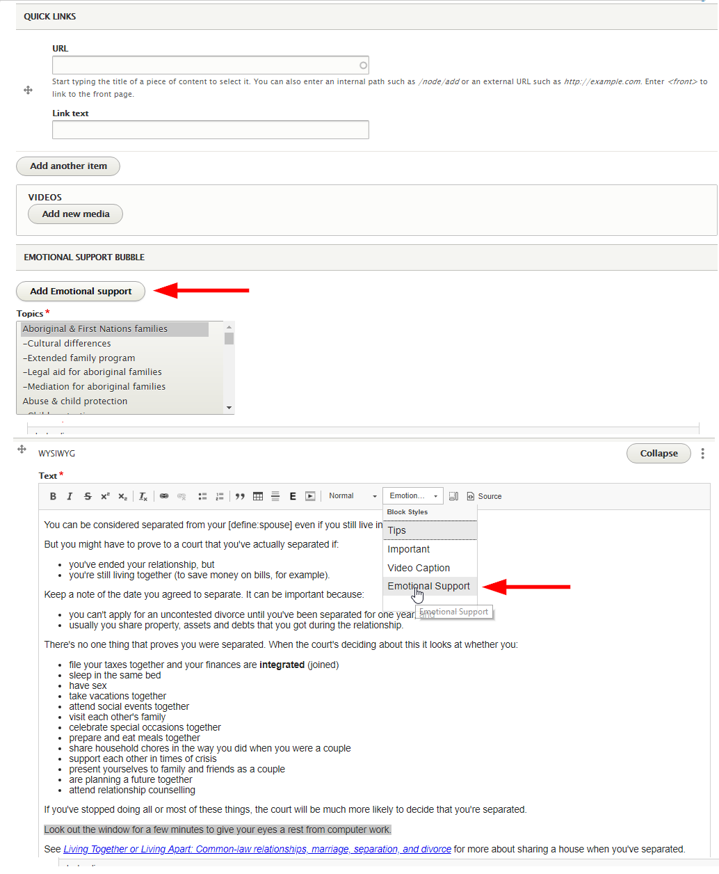
You can add emotional support bubbles to in two ways:
- To the page as a block (guide steps and information pages only)
- In the WYSIWYG as a paragraph style
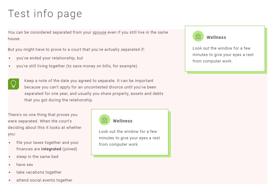
- The page block is for wellness that applies to the whole page and appears in the right column (see image below). You can only add them to guide steps and info pages. The WYSIWYG paragraph style applies to a specific section within that page and appears in the centre column alongside the text.
- On mobile, the page block will drop to the bottom of the page. The block added through the WYSIWYG will stay in line and break up the text.
- The WYSIWYG doesn't format fully, so you'll have to add code manually to get it to appear with the "Wellness" heading, correct spacing, etc. In the page block, you can change the text, but the formatting is preset.
Emotional support paragraph style
The easiest thing to do is copy the code directly into Source view:
<div class="field field--name-field-emotional-support field--type-entity-reference-revisions field--label-hidden field--items">
              <div class="field--item">  <div data-quickedit-entity-id="paragraph/" class="paragraph paragraph--type--emotional-support paragraph--view-mode--default" data-quickedit-entity-instance-id="0">

            <div data-quickedit-field-id="paragraph//field_title/en/default" class="field field--name-field-title field--type-string field--label-hidden field--item">Wellness</div>

            <div data-quickedit-field-id="paragraph//field_content/en/default" class="field field--name-field-content field--type-text-long field--label-hidden clearfix field--item"><p>TYPE YOUR WELLNESS TEXT HERE.</p></div>

      </div>
</div>
          </div>
Edit the bubble text in line 4. The "Wellness" heading is editable in line 3.
Menu settings
Navigation
If you're creating a new page, you'll need to link the page to the navigation. Look to the bar on the right hand side. Under "Menu settings", click "Provide a menu link." Select the parent page from the drop-down menu.
Weight
The weight affects the order the page sits in relation to other pages in the left navigation. The "lighter" the weight (up to -20) to higher it will sit in a list. The "heavier" the weight (down to 20), the lower it will sit. If the weights are the same, they'll sort alphabetically.
Metatags
Write a brief description of the page.
Leave the page title as default "[node:title] | [site:name]." (This is what appears as the tab title and as the name of the page in search engines.)
Optional to add an "Abstract" (can be the same as the description). This is for us only, so it's not important.
Leave the keywords (for now at least).
Editing tags
Check "Fix links" if there are links on the page that you'll need to go back in and correct. You can see all pages tagged with "fix links" through the taxonomy.
Publish
Publish content when you're done. Note you can't link to pages that are in Draft mode.


